
Last week we gave a presentation (in Hebrew) in a series called “Homrah Ve-Ru’ah” for the Hadarim Center for Israeli-Jewish Culture. It’s a basic intro to our projects, but it includes some new findings. There’s also a fun Q&A session at the end.
Category: metrics
Jew In The City? Population and Responsa
Many of our readers are probably familiar with JewishGen, the premier resource for Jewish genealogical research. For quite some time, we’ve had our eye on their Communities Database, which contains information on the history, names, coordinates, environs, and population for Jewish communities in Europe, North Africa, and the Middle East. We have often used it to help us identify places, which involves a lot of guesswork since their search engine only allows Latin characters without diacritics.
You may have noticed the JewishGen logo to the right. We put that there because we recently met with the good folks at JG, and we agreed to all help each other out by sharing data and resources with each other and with the public.1Be advised: Moshe will happily go the full NASCAR for datasets.
What does this mean? It means new and better toys. For instance, that thing about not being able to search for places by Hebrew characters? Well check out our searchable map of Hebrew place names:
As of now, this table has a bit under 4000 place name variants in Hebrew characters. Once we complete the merge of our list with JG’s list, that number will more than double. And we have also started merging these lists with Berl Kagan’s Sefer Prenumeranten. Play around with it. There’s nothing like it, and this is just an “alpha” version.
It also means that Moshe got to play around with the population data in the Communities Database. We have wondered for some time whether there is any relationship between the population of a community and the number of responsa sent there.
So is there a relationship? The short answer: It’s complicated.
Let’s compare some of our favorites (a note: we used 1900 for availability reasons, surprisingly, there’s not a strong penalty for correlation when using earlier poskim). We’ve dropped communities with over 20,000 Jews from the graph, and also because there might be other effects going on over there.2I have a very strong suspicion that this is subject to a major prewar / postwar gap.

If this reads as a horrible mess to you, then you’ve read it correctly. This is the picture of statistical noise.
[We’re going to use a lot of numbers here, so for those who aren’t into mathy stuff, here’s the baalebatish version: A perfect positive correlation between number of responsa and population would mean that the bigger the city, the more responsa, no exceptions. It would have a score of 1. If it had a perfect relationship but it wasn’t a straight line, its Pearson correlation coefficient would be a bit lower while Spearman would remain at 1. A perfect negative correlation would mean that the bigger the city, the fewer responsa (or the more responsa, the smaller the city), no exceptions. It would have a score of -1 (again, with Pearson being lower if it isn’t linear). A score of zero means that there’s no correlation at all. With this, the numbers that express the correlation should be basically intelligible and always between -1 and 1.]
The strongest individual correlation here is Mahari Aszod at a whopping R=0.175, and he’s not even near contemporaneous. Among the poskim who were active around then, we have Avnei Nezer at R=0.04, Beit Yitzchak at R=0.11, Divrei Malkiel at R=-0.04(!), and leading the pack, Levushei Mordechai at R=0.14 (Pearson). Using Spearman it teases out a little higher, but still nothing awe-inspiring.
Let’s keep going: what happens when we sum the place counts together?

As evidenced by the trendline (or the eye test), it’s pretty grim.
Even just looking at the count of books we have, it doesn’t really get better. Regardless of whether you use Pearson, Kendall3For the not mathematically inclined: yeah, you can forget about Kendall, don’t bother., or Spearman, R<0.1.4I thought of using more, but I’m scared of P-hacking it by throwing more metrics at it.

I don’t really know quite what to make of it. The main thing I suspect: as a place becomes bigger and more independent, it needs to ask fewer questions (i.e., larger towns “clear the neighborhood”), offsetting the increase in populations (or at least roughly). In that case, there would be a population “sweet spot” in which a town is big enough that it generates lots of questions but not so big that local talent can handle them adequately. And then we might see something like the curve we get if we wildly overfit a trendline:

This remains an open question for me, but I still wanted to publish this. Let me explain myself. Firstly, given the amount of noise here, it’ll take a long time for us to fully clarify the issue.
Elli asked me the following questions when I showed him the draft, and I think they’re interesting:
- Maybe we should simply disregard towns that were known to have rabbis who wrote responsa, and then look at the rest?
- There’s a “nudnik effect”: Like Levushei Mordechai to his son-in-law in Galante.
- Or maybe it’s not about cities at all, but about people. The carryover we saw in Hungary – maybe it was really carryover of individuals, not cities.
With regards to (1), well, it wouldn’t bump off enough places to make a dent, and you’d probably just drop it even further. As for (2-3), well, it’s actually all the more striking. These are both very real effects (look for Yaavetz’s over the top disses of some of his questioners(!) in She’elat Yaavetz), but strangely, even this doesn’t bear some obvious statistical linkage to population. These are all real questions, and it’s really very possible the answer could change with more data, but given the data we have at the moment, it’s clear we’d need a lot more data to truly get clarity on this issue.
So why discuss this at all? Well, one of the scourges of modern science is ‘P-Hacking’. To quote Wikipedia: “[P-hacking] is the misuse of data analysis to find patterns in data that can be presented as statistically significant, thus dramatically increasing and understating the risk of false positives. This is done by performing many statistical tests on the data and only reporting those that come back with significant results.”
For a simple example, if we look at statistically significant as being P < 0.05 (less than a 5% probability of occurring by random chance), well, if we look at 50 different foods in a diet study, we’ve now got over a 90% chance of finding something ‘statistically significant’ by random chance alone.5This is not a random example, those articles about diet studies showing ‘kale causes cancer’ or whatever are almost always p-hacking.
We’ve published stuff with attempts at very concrete findings — take our post on the handover of rabbinic leadership in Hungary, for example. Honesty dictates that we also on occasion say: ‘it’s hard to see a signal in the noise here’, even if you can’t get a journal to publish ‘nothing much to see here, folks’.
I wanted to title this post “Baby Keep It Real With His People”, referencing the hit song ‘Baby‘ by Lil’ Baby (feat. DaBaby). Sadly, despite my best efforts, the number of fans of both responsa and Atlanta hip-hop remains small, so it went. Suffice it to say, in both data and rap, HaMapah supports Quality Control.
Measuring the Geographic Similarity of Poskim*

There’s a phrase that people like to quote, “labels are for cans”. While the statement’s intentions — either “stereotyping is bad” or “I’m a special snowflake”–are good and relatively inoffensive, respectively, it makes for bad epistemology. It’s a terrible approach to organizing information.
To understand, we need to generalize. To understand the course of any field, we need a broader understanding, a concept of a movement or a style. Sometimes, this division can take on an objective aspect. At an extreme, an artistic group like the Pre-Raphaelite Brotherhood or the Wu-Tang Clan has a defined set of artists who comprise it. However, even that can quickly break down. Ford Madox Brown is stylistically part of the Pre-Raphaelite Brotherhood, he hung out with them a lot, and his work is displayed with theirs, but he was never a member. Broader characteristics run into issues like this too. Kanye West may be from the Midwest, but to the accepted meaning of a “Midwest Rap” style, as exemplified by Twista, Tech N9ne, Krizz Kaliko, Royce Da 5’9”, or Eminem, an emphasis on technical mastery, speed, and precision, with a smattering of themes from horrorcore, he’s certainly not that.
So when I try and discuss data-informed categorization, it’s important to clear up my intent up front. In terms of intellectual categories, I’m not trying to remove subjective judgements. I’m trying to inform. The goal here is to present another variable that can be incorporated into a broader stylistic judgement. The actual measured effect of a posek in terms of area of direct influence, implied or otherwise, should certainly factor into any intellectual taxonomy, and certainly ought to dominate a taxonomy of the landscape.
Our maps have their limits. When we have areas of influence that are completely disjunct, it’s trivial to draw the appropriate conclusions with the eyeball test. However, what to do with somewhat overlapping sets of a couple hundred points each? How do we meaningfully assess the relative similarities of multiple sets of a few hundred points of different sizes, all weaving in and out of each other?That’s where the math comes in.
Our basic metric is cosine similarity. For readers who don’t remember much about sines and cosines, here’s a little refresher. The cosine of 0 is 1, and the cosine of 90 degrees is 0. The more acute an angle, the closer it gets to 1.
Now, let’s imagine two poskim. Posek A writes responsa only to Minsk, and Posek B writes responsa only to Pinsk. Imagine that we plot this on a two-dimensional grid, with the X-axis representing responsa to Minsk, and the Y-axis representing responsa to Pinsk. Each posek can then be expressed as a point in the grid: Posek A as (M, 0) and Posek B as (0, P), because Posek A writes 0 responsa to Pinsk, and Posek B writes 0 to Minsk. That is, Posek A is expressed as a point on the Minsk axis, and Posek B as a point on the Pinsk axis. We can then think of our poskim as line segments, or “vectors”, from the origin to the grid coordinate. It’s obvious that the two vectors in our case are orthogonal. They form a right angle, and thus have a cosine of 0. This means that they are perfectly dissimilar; they have no places in common.
Now imagine Posek C who also writes only to Minsk. Her vector will form an angle of 0 degrees with Posek A’s vector, so they will have a similarity score of 1, which is the cosine of 0.
This exercise is meant to show how the cosine of two vectors provides a good metric for scoring similarity. It’s not perfect, but it’s good.
Two dimensional space is pretty easy to envision, but dealing with 500 place names requires a 500-dimensional vector space, which is impossible to envision. Fortunately, thanks to math, we don’t need to envision it. And since there cannot be any negative numbers (because it’s impossible to send a subzero number of responsa to a place), the angle between the vectors will always be between 0 and 90. We can compare any two poskim to obtain a similarity score between 0 and 1.
Let’s walk through the basic process again with vectors in 4 dimensions. We start with the data from two poskim.
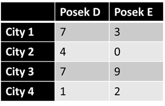
So this table will become two vectors, for Posek D [7 4 7 1] and for Posek E [3 0 9 2]. The order of the cities doesn’t matter, provided that they are respective — that the nth place in each refers to the same place. We then take the angle between the two vectors. In this case, the angle is about 34.2 degrees, and the cosine of the angle is 0.827.[1] Since the cosine goes from 0 to 1, the similarity between the poskim is high. This passes the eyeball test, too; there is no city to which E writes that D does not write to, and only one that D writes to but not E. This is a lot more similar than we’d expect in reality. As we have seen, the career of a posek is dynamic; they move, and their sphere of authority grows and shrinks and shifts over time, and communities likewise change. When we divide a posek’s career in half chronologically[2] and compare the first half to the second, the cosine tends to be in about the 0.35-0.5 range (typically around 0.4). Therefore, when two poskim score 0.3 or above, it means they are very similar in terms of geographical reach. A score above 0.4 means that the geographic reach of the two poskim are as similar as two halves of the career of a single posek, or about as similar as can reasonably be expected.
We can formulate another version of this, where we turn the vectors into binary vectors — D now gets [1 1 1 1] and E [1 0 1 1], the effect here being to just ask about where, without regard to distribution. We call this “unweighted”. We use a third type here — “mixed” — a simple average of the two. Crucially, the size of the vector — the distance from the origin — doesn’t impact the angle, so we can measure between people with very different corpus sizes.
What can we get from this? For starters, can we justify traditional divisions? Let’s take a look.
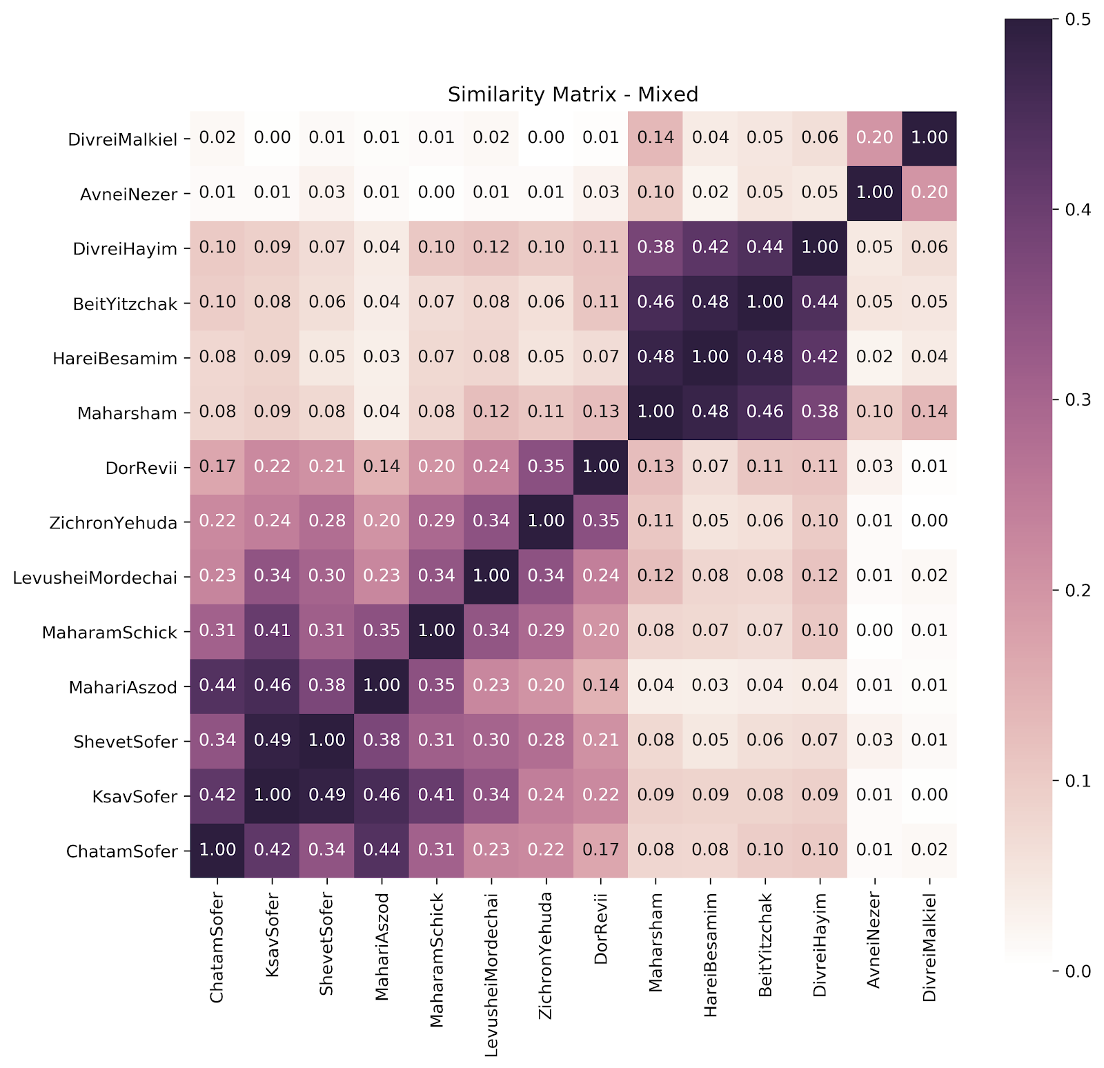
We can see a pretty clear division here — with Hungarians and Galicianers following the expected division, and a showing for our Poles (Avnei Nezer and Divrei Malkiel) of “close but no cigar”. (Divrei Malkiel was the Rav of Łomża, close to Lithuania; some may protest his being lumped with the Poles.) Let’s drop them for now.
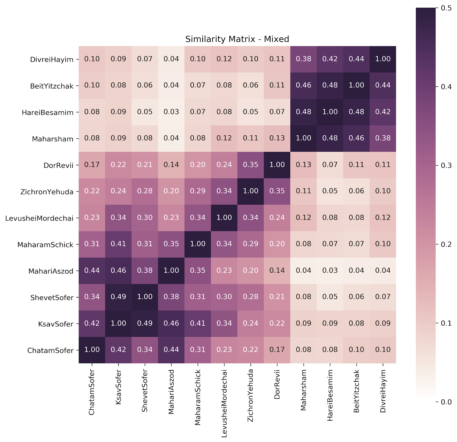
So we see a really clear division between the Hungarian and the Galicianers. The Galicianers are all quite similar to each other, and all mostly dissimilar to the Hungarians. But there’s another thing going here too. Let’s take a look at just the Hungarians. And we’ll rearrange it here.
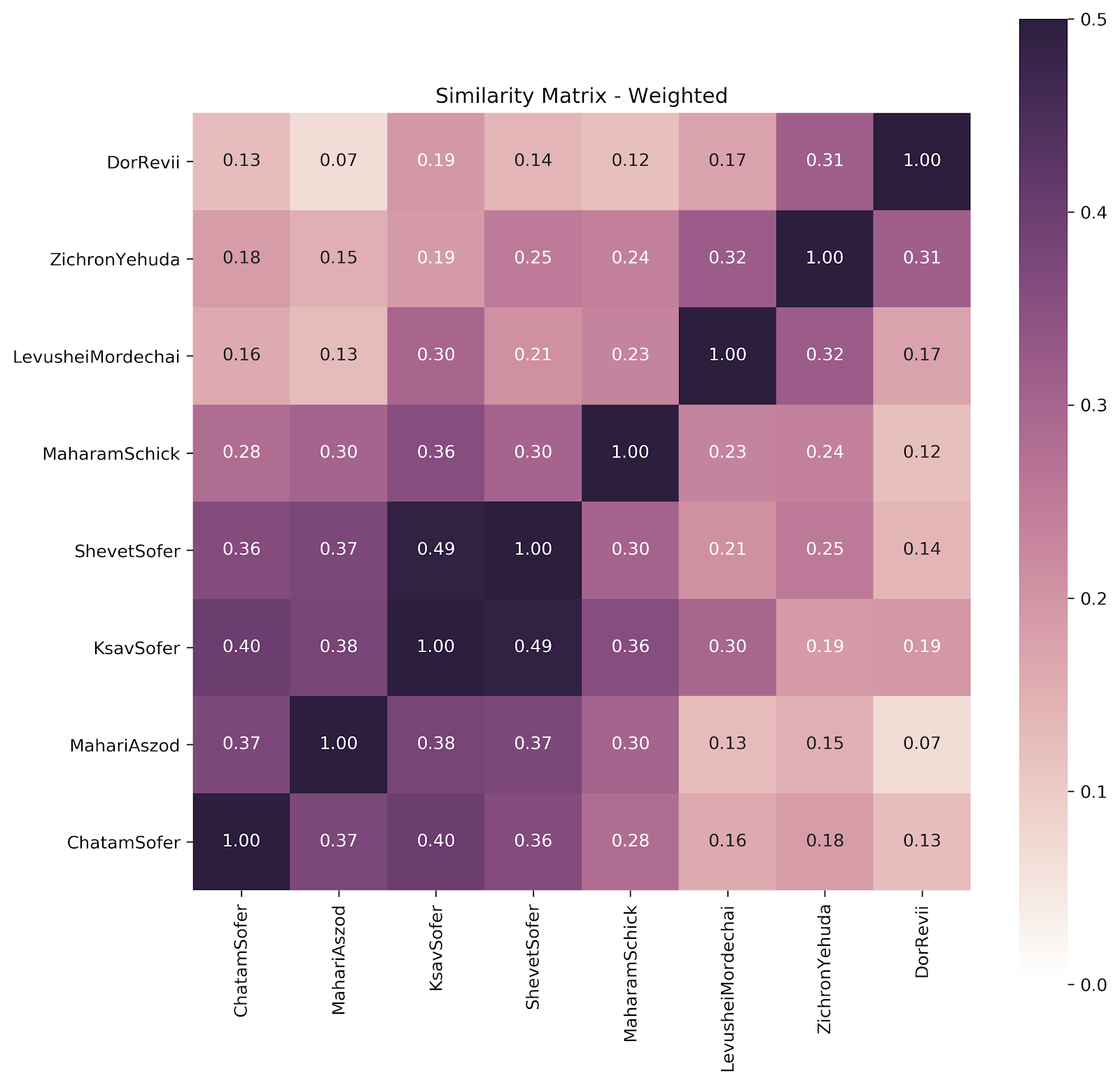
We can tease out a couple more things here. We can see the Sofer family — Oberland cluster clearly; the Maharam Schick (who moved from Oberland to Unterland mid-career);belongs there too, but a little less; the two most Unterland Unterlanders pair nicely, and the Levushei Mordechai (who also moved) straddles the two.
Further data would be nice (and we’re working on it), but what we have thus far suggests that we can view Hungarians as a distinct species, as it were, with Unterland and Oberland subspecies (and those who straddle both).
I’ll add another point — preliminary results thus far delineate that Hasidic psak is a subgroup within regions. Hasidic poskim do not command broad loyalty beyond their region. This may also well be the case beyond just the geographical spread data, in terms of methodology and style as well; for one example that comes to mind immediately, we hypothesize that Chabad’s tendency to rule strictly about eruvin is linked with their being a Hasidic subset of Lithuanians, not a Lithuanian subset of Hasidim.
[*] Thank you to R. Dan Margulies, who hashed out the math here with me (Moshe).
[1] In reality, we don’t ever take the actual angle, we calculate it as dot(u,v)/(norm(u)*norm(v)).
[2] Meaningful divisions here are less similar than random divisions. People die, people move, and various other events mean that we see a grouping that is “lumpy” — dividing a corpus chronologically does not approximate an even division. In a random division, any discrepancy between the similarity and 1 would be pure noise. Here, there are signals going on too.